The Wall pt2
- SHANNON ROCHE

- May 19, 2021
- 3 min read
I have finally mounted all my images on the black foam boards I bought. After a lot of mistakes I did it, and here's what happened:
I first tried looking at the images with black borders- I tried this digitally before and I wasn't a fan but I thought that it might look differently physically.

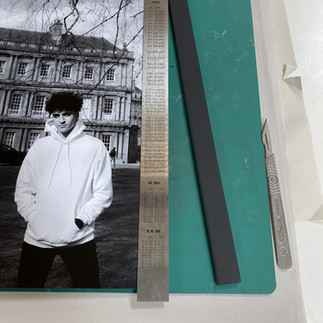
(This photo is very bad! But for some reason it's the only one I took?! What was past me thinking?)
As you can see if I was to do black borders around my work it would either just have to be on the sides or I would have to trim all the images slightly which would be a hassle.
With the borders on the side it resembles film slightly- which can cause people to think that there's a story/ narrative behind the series- which isn't really true. If anything each individual images has a story but that's up to the viewer to decide. Also, the bars are all different sizes
which isn't at all pleasing to look at and it would take too much time, which I don't have, to create some measurements to make them all the same size.


After comparing borders and without borders, it's clear to see that the images without borders are so much better and less distracting to the image.
So I spoke to Karen to get the best advice on how I should trim the foam boards. She suggested that I use a scalpel and a ruler.


First I practiced on a scrap piece of foam and one of my practice images- I soon discovered it's all about the weight you put down on the scalpel. You don't want to push too lightly or too heavy. Also it's good to frequently change the blade on the scalpel to always have that clean cut.


I used spray mount to stick the images down onto the foam boards and then I used a metal ruler to make the cut straight. This was quite time consuming- it two me two days on campus. I also had to go down to the photography studios to use a bigger metal ruler to do the A3 images (which were more difficult to do!).
There was also an issue with the "David" images as there was a little rip at the top of the paper- so I had to take a tiny bit off the top but it hasn’t affected the images drastically which is good. There was also an issue with the "Laura" portrait too as there was a mark on the first print of her- i'm not sure how or why it got on there. So I then printed her off again but it had a blue tinge to it which wasn't what I was looking for. I tried to pretend like it didn't matter so I layout the images again and she stuck out like a sore thumb so I had to print her off again!
I realised my mistake however, when I printed her off for the third time- the printer was on the wrong setting- the setting used for a more vibrant and colourful not black and white. Like they say- thirds times a charm, and the third print is okay (so far, I don't want to jinx it!)
After mounting all the images on the foam boards I experimented with the layout of the images again. I want to try all of the possibilities before I decided on the best one! Here's what I have so far:


Obviously the last one has been my favourite so far through the project, however I thought I would try to experiment more and not be stuck in one place like I was with the urban landscapes.
Something I did decided before this was that I wanted small spaces in between the images- it just makes the whole typology more appealing to look at.
I quite like the bottom two, they are the most satisfying to me- there is only a small difference between to two.
I think that those two are the only ones I have to decide from but I can't be 100% sure yet until I put it up on the wall during curator week- as right now I am just trying the layouts on the floor which doesn't really give off the same effect as it will on the wall.


Comments